As a small business owner, do you ever feel like the competition is just getting more intense, no matter how many sales you run or innovative products you bring in?
Do you watch the foot traffic outside your retail shop, worried that half the passerbys don’t even realize you’re there?
In today’s hyper-competitive retail landscape, standing out from the crowd can feel like scaling a rocky cliff in a pair of old flip-flops.
Online marketing bombards consumers, brick-and-mortar giants cast long shadows, and your charming little shop can easily get lost in the shuffle.
But there may be a tried-and-true, timeless solution that you’ve overlooked.
The simple yet well-designed, strategically placed retail banner.
- Retail Banners are an excellent and effective way for businesses to bring attention to their storefront.
- When using retail banners, opt for optimal locations, adapt seasonally, and strategically place banners in high-traffic areas.
- Make sure that you craft persuasive messaging, incorporate limited-time offers, and measure effectiveness to convert foot traffic into sales.
- ― Captivating Your Audience: The Psychology of Retail Banners
- ― Driving Traffic: The Art of Location and Placement
- ― Easy Signs…Helping Give Your Business the Boost it Needs
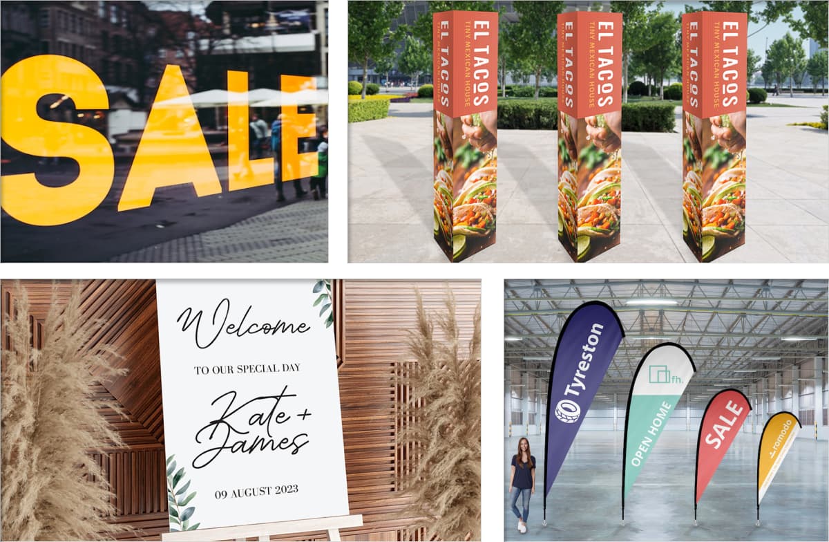
While digital presence and social media feeds may be a necessary part of today’s retail marketing, a well-crafted retail banner can also be a vibrant and tangible ambassador for your business, capturing attention from the immediate foot traffic that passes your storefront every day.
Creative custom retail banners are like silent storytellers, working tirelessly to intrigue the world outside your store.
Let’s look at how good storefront banners can turn your window shoppers into enthusiastic patrons for a price that beats just about any other type of marketing that’s available today.
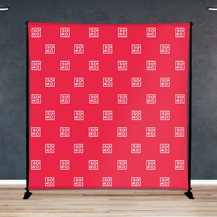
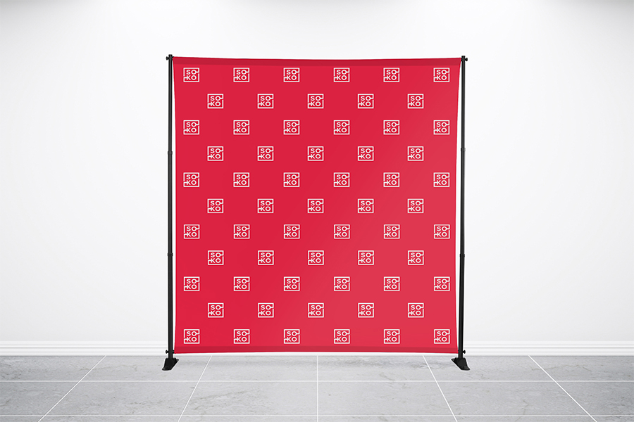
Your Ultimate Guide To Step And Repeat
Banners
Step up your event game with Step and Repeat Banners – your go-to guide for the perfect backdrop.
Captivating Your Audience: The Psychology of Retail Banners
In the crowded world of retail, capturing attention and influencing purchasing decisions takes more than just having the coolest products and best price points.
Understanding the psychology of visual communication can be a true hidden weapon, allowing you to craft signs and retail banners that speak directly to your target audience and turn casual walk-bys into loyal customers.
Let’s explore some of the key elements that can make your retail shop banners a non-verbal masterpiece, influencing shoppers and driving foot traffic into your store.
Understanding Consumer Behavior: How Visuals Influence Shopping Decisions
Our human brains are wired to respond to visuals and we do so all day long, whether it be consciously or not.
Studies show that people remember less than 20% of what they hear and more than 80% of what they see. This means a retail banner can be an amazing attention magnet, but care needs to be taken to make sure it doesn’t cause sensory overload.
First Impressions Matter:
Within milliseconds, consumers judge a store based on its visual cues. A professional and attractive banner acts as a welcoming handshake, building trust and inviting exploration.
Color Psychology:
Color palettes trigger specific emotions and associations. Warm colors like red and orange evoke excitement and stimulate impulse purchases, while cool tones like blue and green convey trust and reliability, perfect for establishing long-term customer relationships.

Eye-Tracking Patterns:
People naturally scan visuals from left to right and top to bottom. Utilize strategic placement of key elements to guide their attention toward critical information like promotions or sales messages.
Creating Eye-Catching Designs: Elements that Grab Attention and Communicate Brand Messages
Now that you understand how visuals speak to your audience, let’s make sure that your banner has all the necessary tools to become the captivating conversation starter you want it to be.
- ✓1. Start with Bold and Simple: Avoid information overload. Use bold visuals, large fonts, and concise messaging to make your banner instantly readable and impactful from a distance.
- ✓2. Emphasize Your Unique Selling Proposition (USP): What makes your store stand out? Highlight your USP, whether it’s a curated selection, personalized service, or environmentally friendly practices…and do it in a compelling and visually engaging way.
- ✓3. Make Your Call to Action Clear: Don’t leave your audience wondering what to do next. Include clear and actionable calls to action like “Shop Now,” “Explore Inside,” or “Limited Time Offer” to prompt immediate engagement.
- ✓4. Create Brand Consistency: Maintain a consistent visual language across your marketing materials, including branding colors, fonts, and design elements. This builds brand recognition and strengthens audience trust.
Real-World Examples: How Retail Banners Have Worked for Others
Are you curious to see how retail banners have helped others achieve higher sales, more loyalty, and an overall positive experience for their customers and staff? Let’s look at a few examples of how simple vinyl banners can make your store stand out.
-

The Coffee Shop with a Sense of Humor
A local coffee shop used a dark brown vinyl banner with a bold white font to display the cheeky message: “Warning: Delicious Coffee Inside. May Cause Extreme Happiness.”
This playful approach resonated with their target audience, driving foot traffic and creating a memorable brand image.
-

The Boutique Highlighting Sustainability
A boutique that is committed to ethically sourced clothing chose natural materials in its banner design, visually mirroring its brand values and attracting eco-conscious customers.
-

The Bookstore Promoting a Local Author
A bookstore partnered with a local author and featured their book cover prominently on their sale banner, instantly grabbing already loyal fans’ attention and attracting potentially new fans eager to meet the author during a promotional event.
These examples showcase the power of understanding your audience, crafting clear visual messages, and staying true to your brand identity.
By harnessing the psychology of retail banners, you too can unlock a world of increased customer engagement, brand loyalty, and ultimately, a thriving business.
Your Ultimate Guide To Step And Repeat
Banners
Step into the spotlight with our Ultimate Guide to Step and Repeat Banners! Your picture-perfect backdrop awaits.
Driving Traffic: The Art of Location and Placement
Your captivating banner’s beauty is only half the equation. To truly turn onlookers into customers, you need to position it like a master tactician, ensuring it commands maximum attention and guides eager feet toward your doors. Let’s explore the art of location and placement, turning your banner into a traffic-generating beacon:
Choosing Strategic Locations: High-traffic Areas and Points of Purchase
Think of your banner as a visual bridge connecting curious passersby to your shop.
To build this bridge effectively, it’s a good idea to pinpoint your high-traffic areas where potential customers are most likely to encounter it.
Think about these prime locations:
- ✓Street-facing facades: Capture attention from people walking or driving by, utilizing sidewalk stands or awnings to maximize visibility.
- ✓Entryways and doorways: Greet customers with a warm welcome as they approach your store, highlighting your USP or current promotions.
- ✓Windows and display areas: Showcase your most enticing products or seasonal offers, drawing customers closer to explore further.
- ✓Areas with high foot traffic within your store: Position banners near product shelves, cash registers, or waiting areas to guide customer attention toward specific items or promotions.
Remember, the closer your banner is to the point of purchase, the higher the chance of conversion. Think strategically and place your banner where it can effortlessly guide them towards a sale.
Outdoor vs. Indoor Banners: Maximizing Visibility in Different Retail Settings
Different settings call for different approaches.
Understanding the unique advantages of outdoor banners vs. indoor banners is going to help you tailor your placement for maximum impact.
Outdoor Banners:
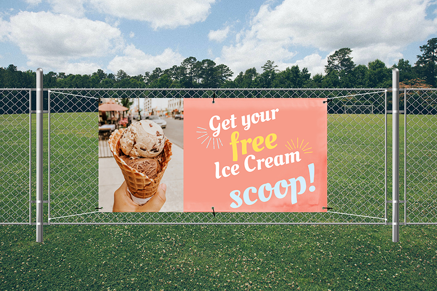
When you are creating an outdoor banner, you’ll want to put extra thought into bold colors, large fonts, and clear messaging to ensure visibility from afar.
You’ll also want to utilize sturdy materials that are resistant to weather and fading to withstand the elements. such as sturdy banner stands, heavy-duty materials, and ultra strong adhesive tabs. Vinyl sales banners work excellent for this purpose.
Indoor Banners:
Indoor banners can be more forgiving with font and banner size, though you’ll still want to make sure your messaging is powerful and on point.
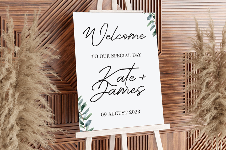
With an indoor banner, you can focus more on highlighting a current promotion, showcase a new arrival, or offer directional guidance within your store.
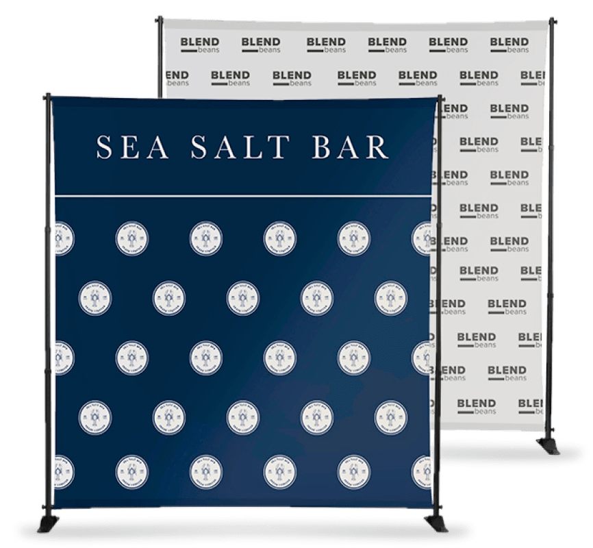
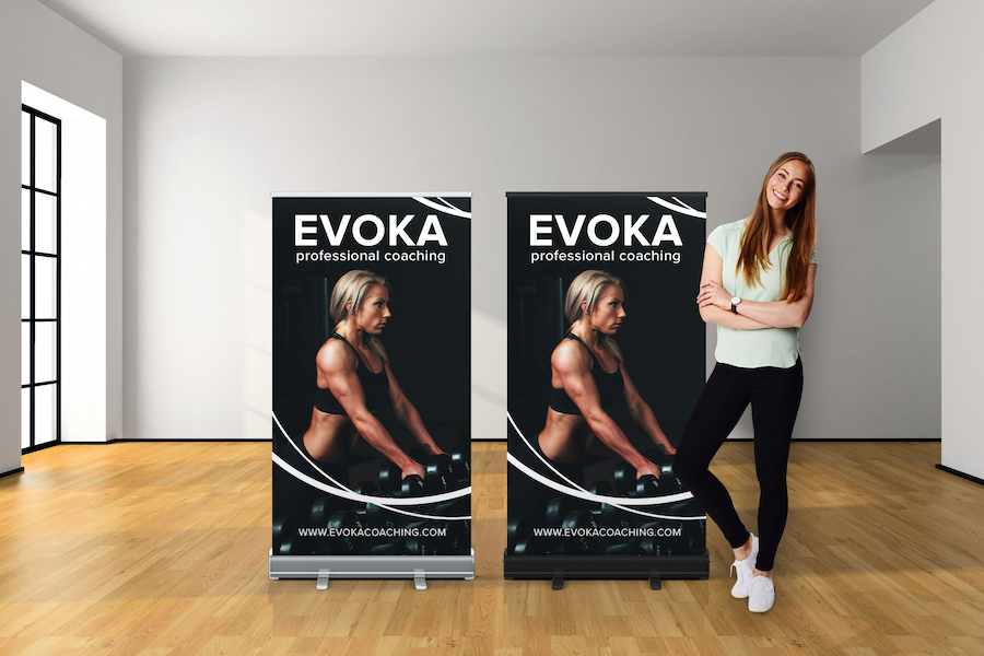
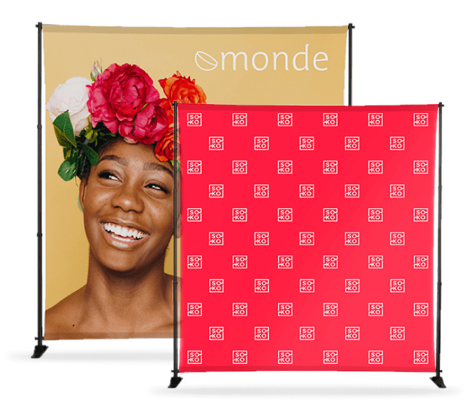
It can also be fun to experiment with the type of banner you may want to use, such as hanging banners, step and repeat banners, and tension fabric displays…all of which can serve as excellent focal points and enhance your customer’s experience. Consider Art Gallery Banners indoors as well, strategically placed to create an immersive environment for art enthusiasts and potential customers.
Seasonal Adaptation: Tailoring Banners to Capitalize on Changing Consumer Interests
Another great way to stay ahead of the customer loyalty curve is to think about adapting your banners to seasonal trends.
This creative approach keeps your messaging fresh and relevant, attracting attention and driving in-store visits during different times of the year when customers are buying for specific reasons and seasons.
Here are a few of the biggest times of the year when customer retail banners will really shine:
- Thanksgiving: Display warm, autumnal colors with images of turkeys, pumpkins, and fall foliage. Banners can be a great way to promote Thanksgiving dinner bundles, festive decorations, and home decor to help customers get ready for guests and the holiday season that’s to come.
- Black Friday and Cyber Monday: Banners are a great way to use bold colors and exciting messaging like “Huge Savings!” and “Deals Galore!” to prepare shoppers for the big Black Friday and Cyber Monday deals to come. Highlight major discounts and limited-time offers.
- Christmas and Hanukkah: Create a joyous atmosphere with festive colors and lights, wintery scenes, and images that will make your retail shop feel like home to your customers. A banner can be a great chance to promote gift ideas, holiday collections, and gift certificates.
- Valentine’s Day: Channel everyone’s interior romantic with pink and red color schemes and hues, hearts, and love-themed imagery. Offer special deals on gifts for loved ones, such as candles, chocolates, romantic dining experiences, clothing…just about any retail item can be considered a Valentine’s gift with the right type of creative marketing.

- August and September: Create banners that highlight the products that make everyone think about back-to-school time. You can showcase backpacks, school supplies, and dorm essentials with vibrant colors and images of students and classrooms. Offer student discounts and bundle deals to encourage students and their parents to shop with you.
- Memorial Day and Fourth of July: Embrace patriotic themes on your banner with red, white, and blue colors, BBQ scenes, and firework graphics. This is a great opportunity to promote outdoor activities, grilling tools, and summer fun essentials.
- Labor Day: Celebrate back-to-school preparations with deals on notebooks, backpacks, and school supplies. Promote end-of-summer sales and clearance items.

These are just a few examples of ways in which you can use retail sale banners to drive more traffic into your space and grab people’s attention like never before.
Remember, the key is to stay relevant to the season, target your audience’s needs, and inject a dose of personality into your banner design.
Easy Signs…Helping Give Your Business the Boost it Needs
At Easy Signs, we know that competition is fierce in the marketplace.
And we also know what to do to help you compete.
With a variety of banner options and an excellent online design tool, Easy Signs can help you take your marketing strategy to a whole new level.
Ready to level up your customer satisfaction? Reach out to us today and let’s get started!
Your Ultimate Guide To Step And Repeat
Banners
Strike a pose with our Step and Repeat Banner guide!
Elevate your event photography game.


 $14
delivery on most products**
 24hr production*